Portfolio website

A behind the scenes of this website
 

This case study contains the design process behind the development of the first prototype of this portfolio website. It describes the rationale behind the components, content and the structure along with challenges faced throughout the project. Plus, it briefly outlines the updates and improvements made after the launch.

My role(s): researcher, designer and developer.

Tools used: Sketch.app, Visual Studio Code, HTML, CSS, Materialize CSS, Animate.css, Google Analytics

RESEARCH

The first step in the process was to understand more about portfolios and the target audience - the recruiters and potential employers.

UX PORTFOLIOS FOCUS ON THE PROCESS

UX portfolios provide a way for recruiters to see the designer's thinking and working style. Therefore, it is crucial to focus on the process than design artefacts.

RECRUITERS DONT READ EVERYTHING

After reviewing several design communities across Facebook, Slack, and Medium, there was a common pattern amongst recruiters. They often skimmed through the portfolio due to time constraints as they need to assess many applicants.

LEARNING FROM OTHERS

To gain inspiration, I examined a few portfolios of well-accomplished designers. Despite the variety of work and projects, there were some common features across the great ones:

CASE STUDIES ARE EVERYWHERE

New designers often lack the work experience to include a comprehensive design project in their portfolios. A couple of common approaches to address this was university and personal projects.

SHOW ENTHUSIASM

Specifically for entry-level positions, most job descriptions highlighted enthusiasm and passion for the role.

 
DEFINING THE PROBLEM

Recruiters need to skim through a portfolio that captures my design process and passion for UX.

 
IDEATING WITH A CONTENT-FIRST APPROACH

With the problem statement in mind, the ideation session began with identifying the components for the portfolio website.
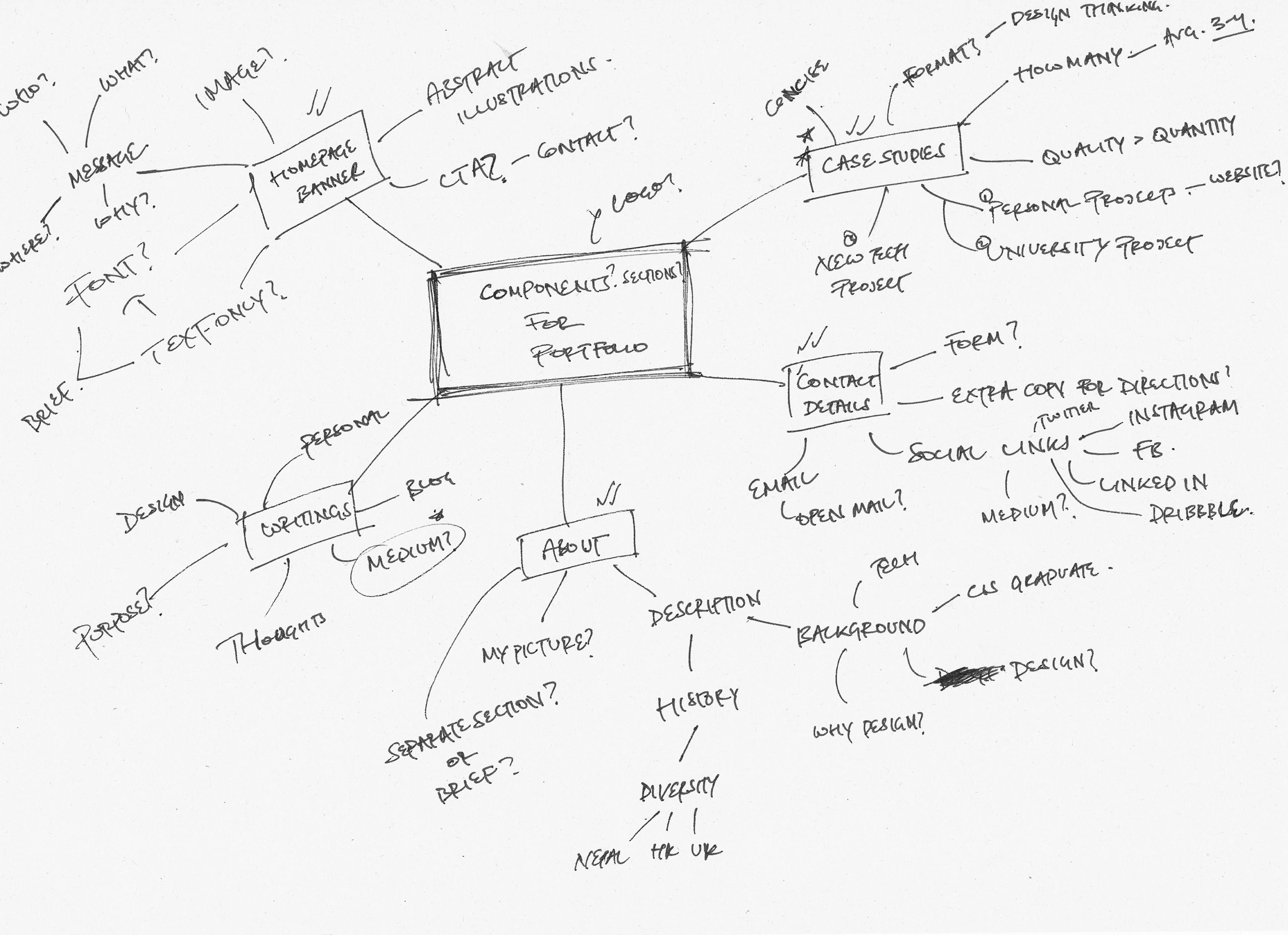
Mindmap of sections and content for the portfolio website. There are five main 
                            branches - homepage banner, writings, about, contact details, and case studies. Each subbranch then lists various
                            components for individual section.
Mindmap of sections and content for the portfolio website

In regards to the problem statement, it was best to incorporate the following vital components first.

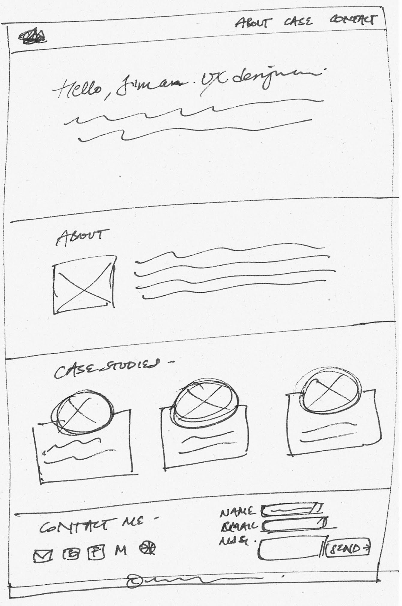
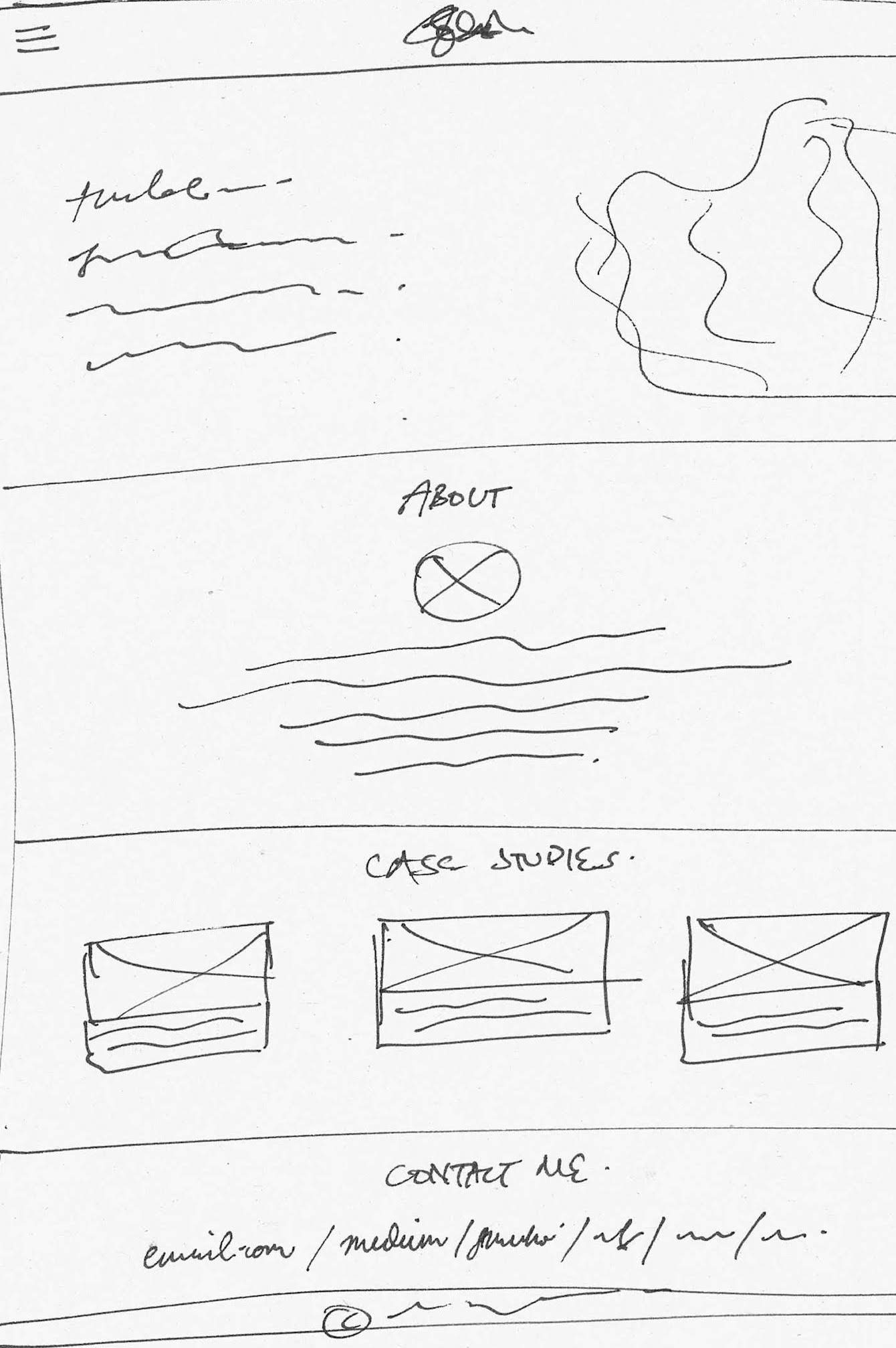
The following sketches aimed to quickly explore some of the possible layouts for the components.
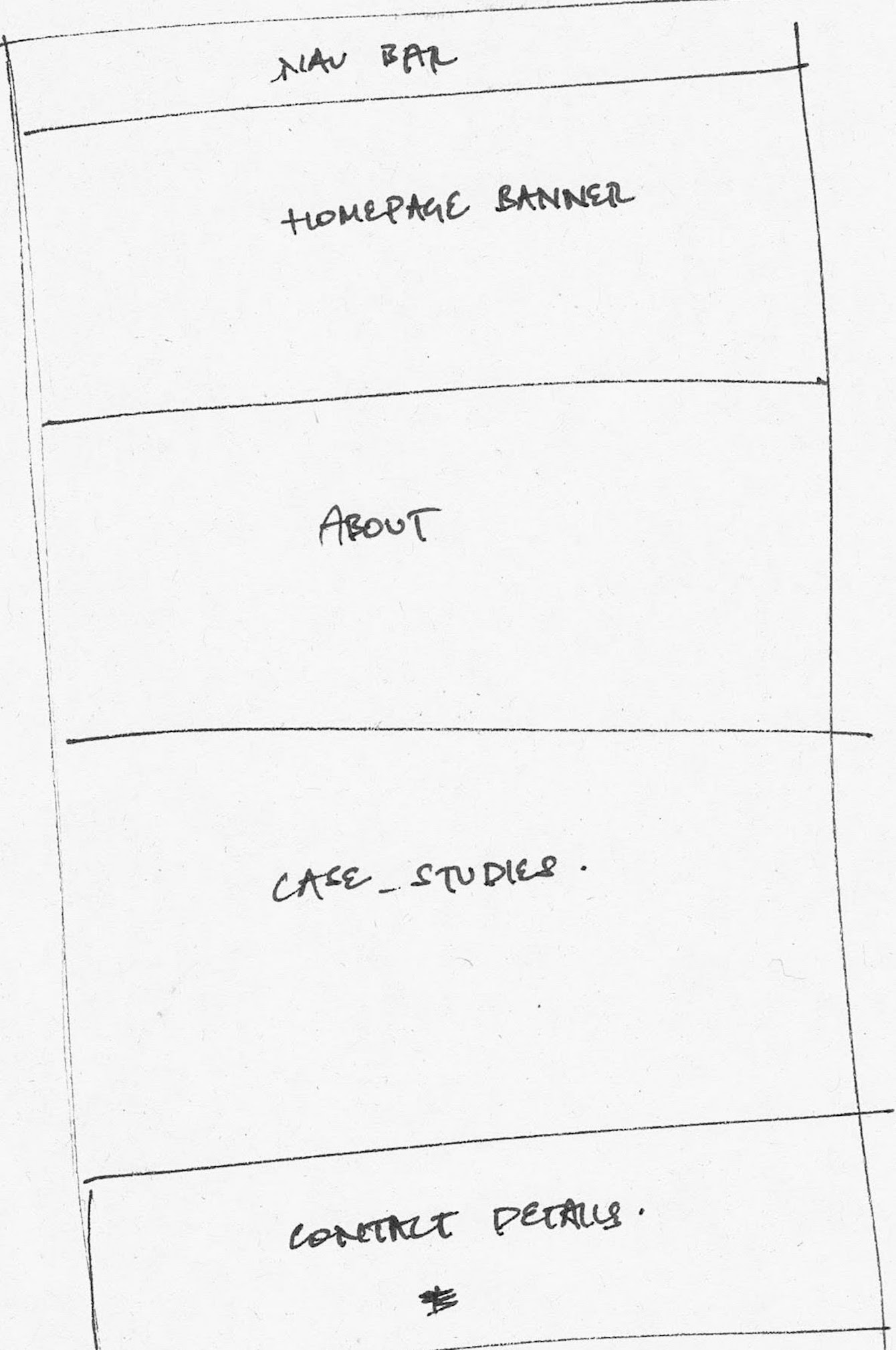
Initial handrawn sketch of the layout which divides the screen into six compartments. 
                                    At the top, there is the nav bar, then a homepage banner followed by an about section, case studies section, contact section
                                    and the footer.
Initial sketch of the layout
A sketch of the main page of the portfolio with components and layout.
Sketch of layout and components for indidividual sections
A sketch of the main page of the portfolio with components and layout.
Another sketch of layout and components for indidividual sections

WIREFRAMES

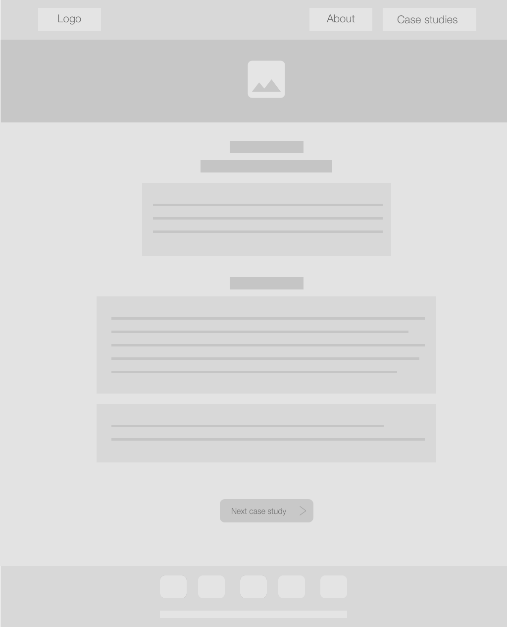
After exploring some possible layouts, wireframes were produced to capture the best aspects of all the sketches to guide the visual design.
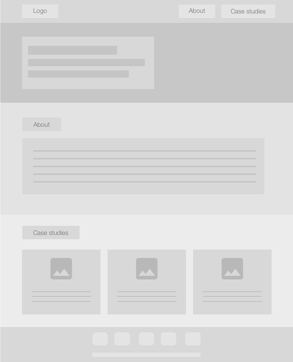
The homepage wireframe of the portfolio.
Wireframe of the homepage
Wireframe of a case-study page.
Wireframe of a case-study page

HIGH FIDELITY

After considering the technical constraints and capabilities, the following static high-fidelity prototype was produced using Sketch.
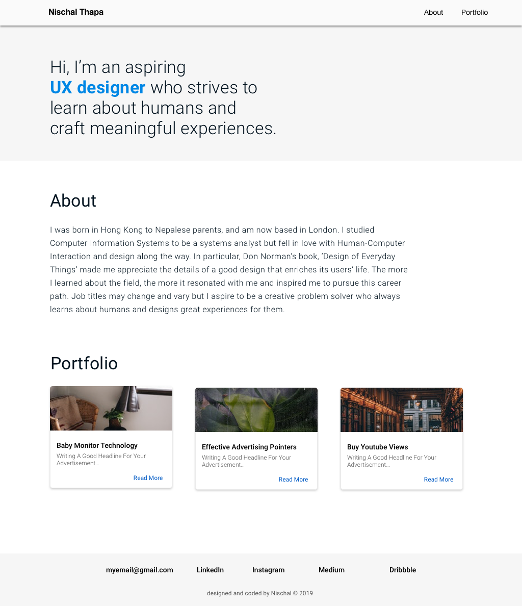
High-fidelity static homepage.
High-fidelity static homepage
WRITING CASE STUDIES

Prior to development, I decided to draft the first case study to give ample time for revisions. The initial draft was written in Google docs to focus on the copy over media. After several drafts, the case study was good enough to proceed to development.

DEVELOPING THE FIRST PROTOTYPE

There were a couple of popular options like Wix and WordPress in terms of developing the website. Although these offer speed and ease of implementation, I wanted to gain hands-on experience with front-end development. So, I decided to code the website myself.

A quick course on HTML, CSS, frameworks and Javascript equipped me with enough foundation to start developing. In terms of aesthetics, I was particularly looking for frameworks that encapsulated Google's Material Design since it offered the look and feel I was aiming for.

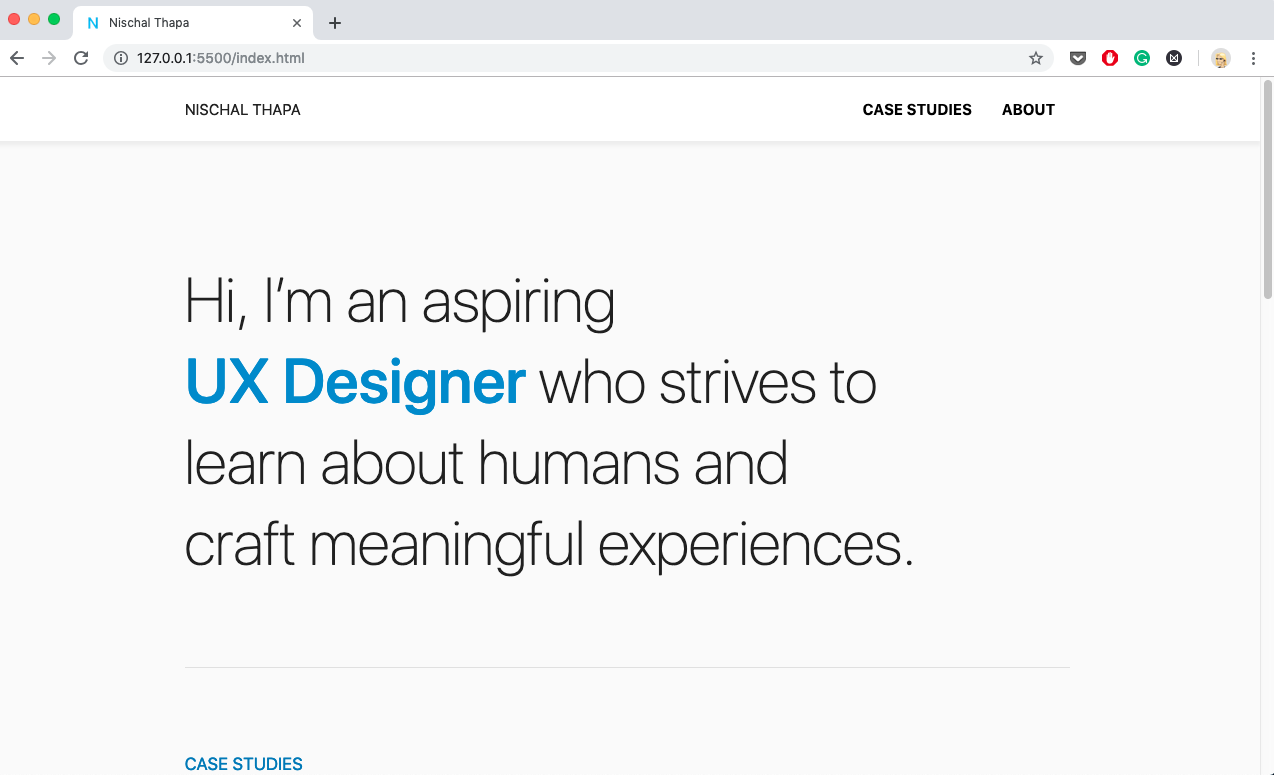
At first, I tried Google’s Material Components but soon found it to be over-complicated for the purpose. Therefore, an alternative framework, Materialize CSS was used. It offered all the elements I needed like the ripple effect and cards with a relatively simple implementation. This along with Animate.css offered everything I was looking for.

High-fidelity static homepage.
High-fidelity static homepage

After countless compromises, iterations and internal tests across various web browsers, the portfolio website was finally ready to be tested by external users.

QUICK EVALUATION

The purpose of this quick evaluation was to collect general opinion and test the usability of the website, e.g. navigation structure, hyperlinks, readability, legibility, etc. So, I asked a few of my friends to test the website. Despite not being the target users, this step was used as a general usability test to gain an external perspective prior to the launch.

REFLECTION

The biggest practical takeaway from this project is the exposure to front-end web development. It gave me a brief insight into how a developer might approach development and a glimpse into possibilities of web technology.

If I could do things differently, I would forgo perfection during the early phases. I got a bit obsessed with aligning and spacing while designing early on that I would waste a lot of time. To make matters worse, once the design spec changed, all of that would need to change as well. Therefore, I believe a better approach would be to embrace the iterative nature of the process and forgo perfection in the early stages.

PORTFOLIO 2.0

The previous iteration was launched rather quickly to meet some of the job application deadlines. I was fortunate enough to hear back from them and had the opportunity to attend an assessment centre and present my portfolio. Although I did not proceed further, this was an invaluable experience as I gained some first-hand impressions and ways to improve myself and the portfolio.

Furthermore, I have been tracking my portfolio's performance in Google Analytics and... lets just say that it needs some work. Therefore, I made some major updates to the portfolio as outlined below.

CASE STUDIES ARE PRESENTABLE

While I was at the assessment center, I had to present my portfolio to a couple of designers. During the presentation, I realized that my case studies were not easy to present from. Thus, I made a lot of minor changes throughout to make sure I highlight the important parts during presentations.

MORE CONTENT

Previously, I only had two case studies and links to my social media where I posted my other design works. However, some recruiters do not visit those work so I decided to bring a selected few here by incorporating them in side projects.

A LITTLE MORE ABOUT ME

The previous About page featured a poor and generic layout. Thus, I made some aesthetic adjustments and added a little bit more about myself in this iteration.

LINKS EVERYWHERE

There are now more internal and external links throughout the portfolio for two main reasons. First, visitors can directly access relevant content and learn more if they wish to do so. Second, SEO.