PERSONAS
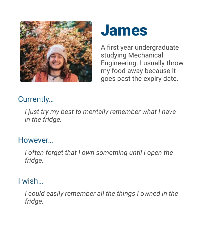
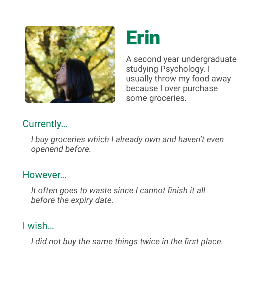
A couple of personas were created using the research data to capture the essence of the target audience. Although not comprehensive, these provide a quick overview of the target audience.
This case study is based on my final year individual project for an undergraduate
degree in Computer Information Systems. It documents the design process of an Android application
that attempts to address food waste amongst fellow undergraduates. Whilst the dissertation involves
theoretical research on persuasive design and HCI, most of it has been
omitted to keep this brief.
My role(s): researcher, designer and
developer.
Constraints: the production of codebase, academic references, other course commitments, etc.
Tools used: Android Studio, Java, XML, Pages, Material Design, etc.
The project started with a vague notion to save the environment by encouraging fellow undergraduates to lead a sustainable lifestyle. However, a sustainable lifestyle encompasses many activities such as recycling, green transportation, efficient energy consumption etc. Therefore, a questionnaire was circulated to identify a specific domain to focus on.
The results suggested food waste to be the most suitable area since it was a less-known topic amongst the audience and potential for greater contribution.
Further research revealed an individual's shopping, cooking, and storing habits were the main sources of food waste (at a personal level). This informed the design of semi-structured interviews with the following key takeaways.
their shopping behaviour varied but majority bought the same items every week
the main cause food went past expiry date because they were unaware of what they owned
items can be thrown away without being used or consumed properly
underlying motivations for avoiding food waste included loss of money and guilt
A couple of personas were created using the research data to capture the essence of the target audience. Although not comprehensive, these provide a quick overview of the target audience.


As mentioned earlier, money and guilt were the dominant reasons why people felt bothered about food waste. Therefore, the positive spectrum of these aspects were considered as motivation while ideating solutions along with the problem statement.
The project requirements along with my experience and research led to the solution in the form of an Android application.
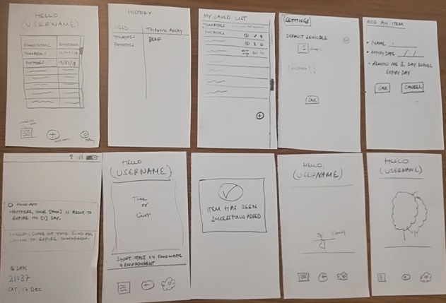
Low fidelity paper sketches were shown to prompt the audience to get their initial feedback and opinions.
EARLY USER FEEDBACK
clearDisliked the idea of a tree growing as a result of more sustainable actions
doneFavoured the concept of separating wasted food and consumed food
add_circleWanted more practical features e.g. history, performance
add_circleWanted it to be more engaging and fun
add_circleWanted to simplify mechanism to save a food item
Ideally, I wanted to spend more time exploring different possibilities but had to move on to prototyping due to time constraints.
The feedback from the sketches was incorporated into the following high-fidelity prototype. The aim was to develop a functioning prototype with key features for evaluation purposes.
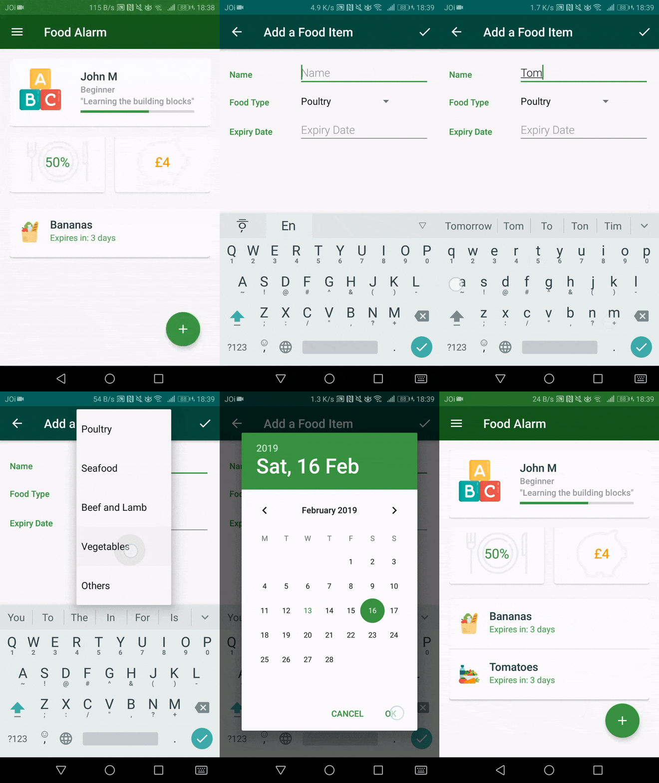
The user can add food items they purchase to the list including its name, type and expiry date.
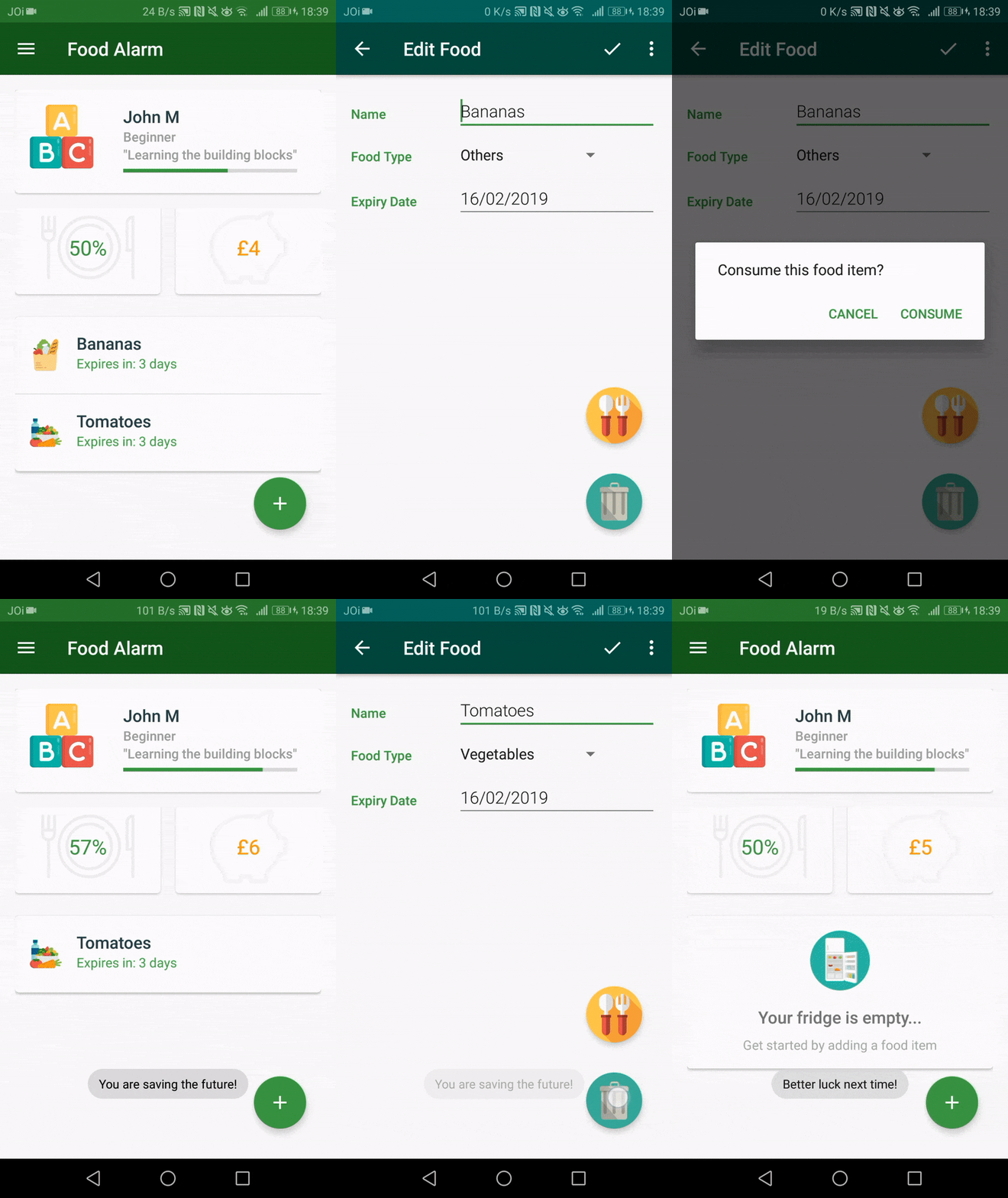
The user can remove the food item from the list by selecting whether they consumed it or threw it away.
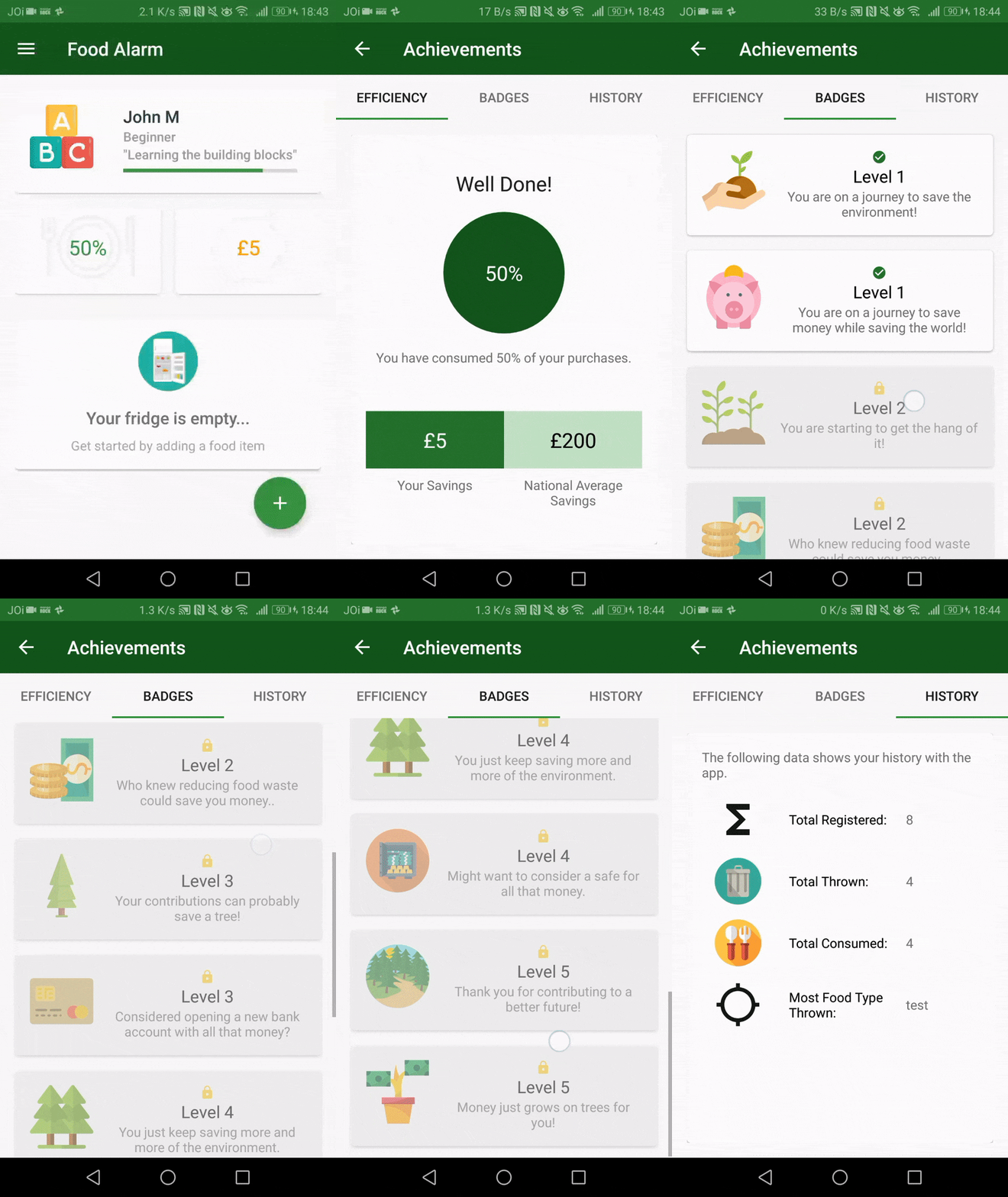
The user can monitor their performance in the achievements screen, which shows the proportion of food they consumed.
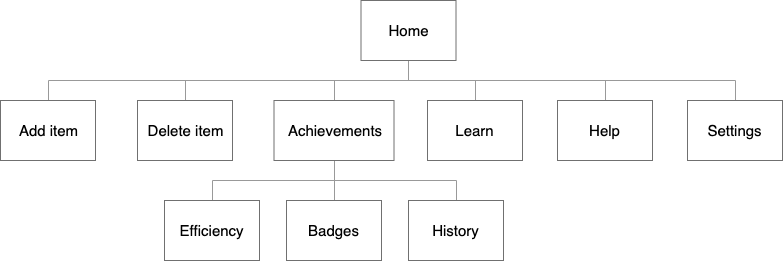
NAVIGATION STRUCTURE
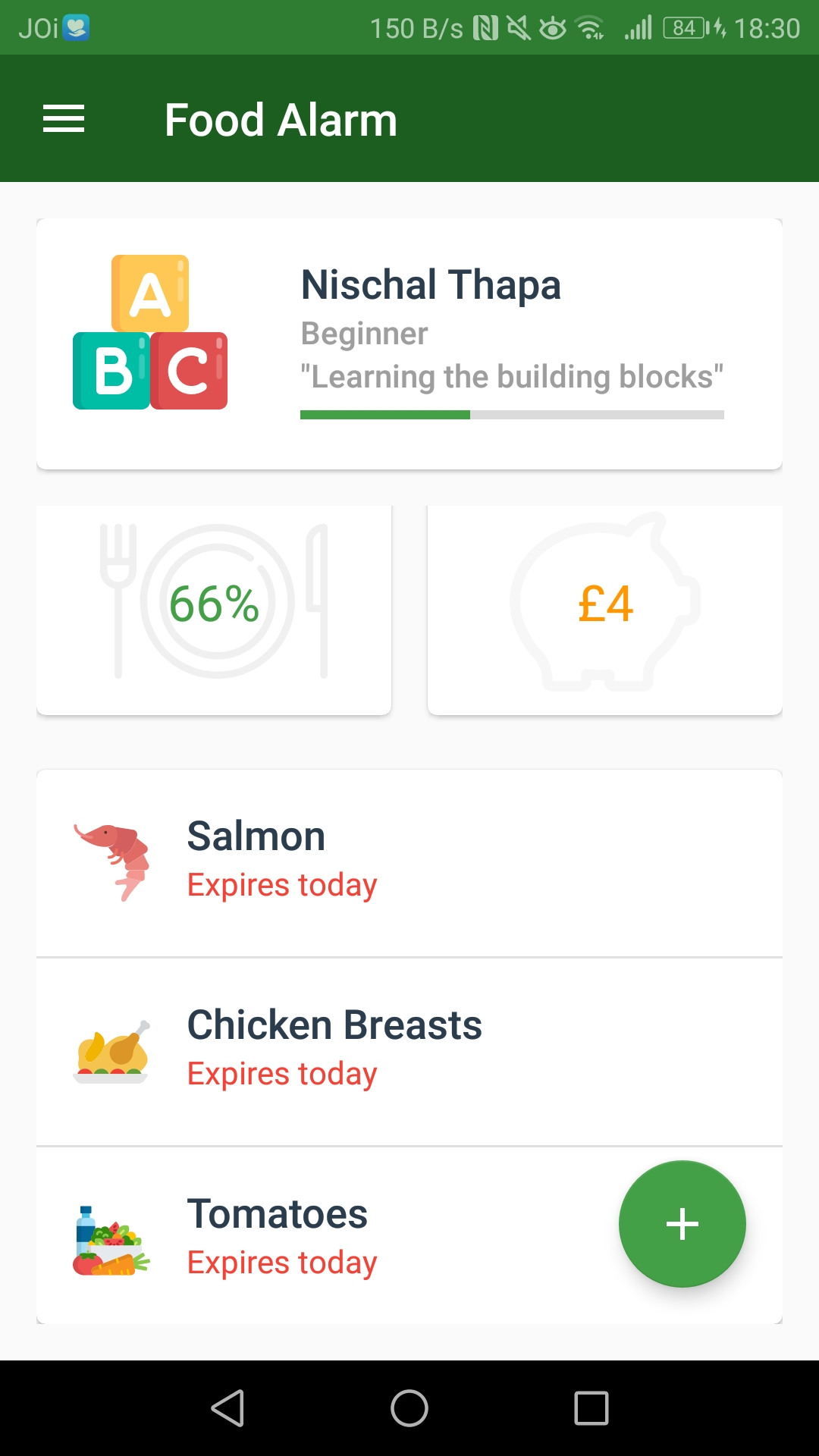
INDIVIDUAL SCREENS
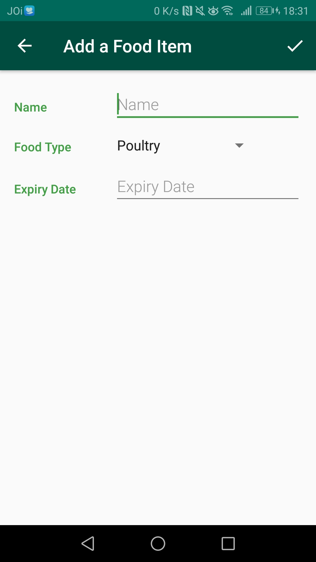
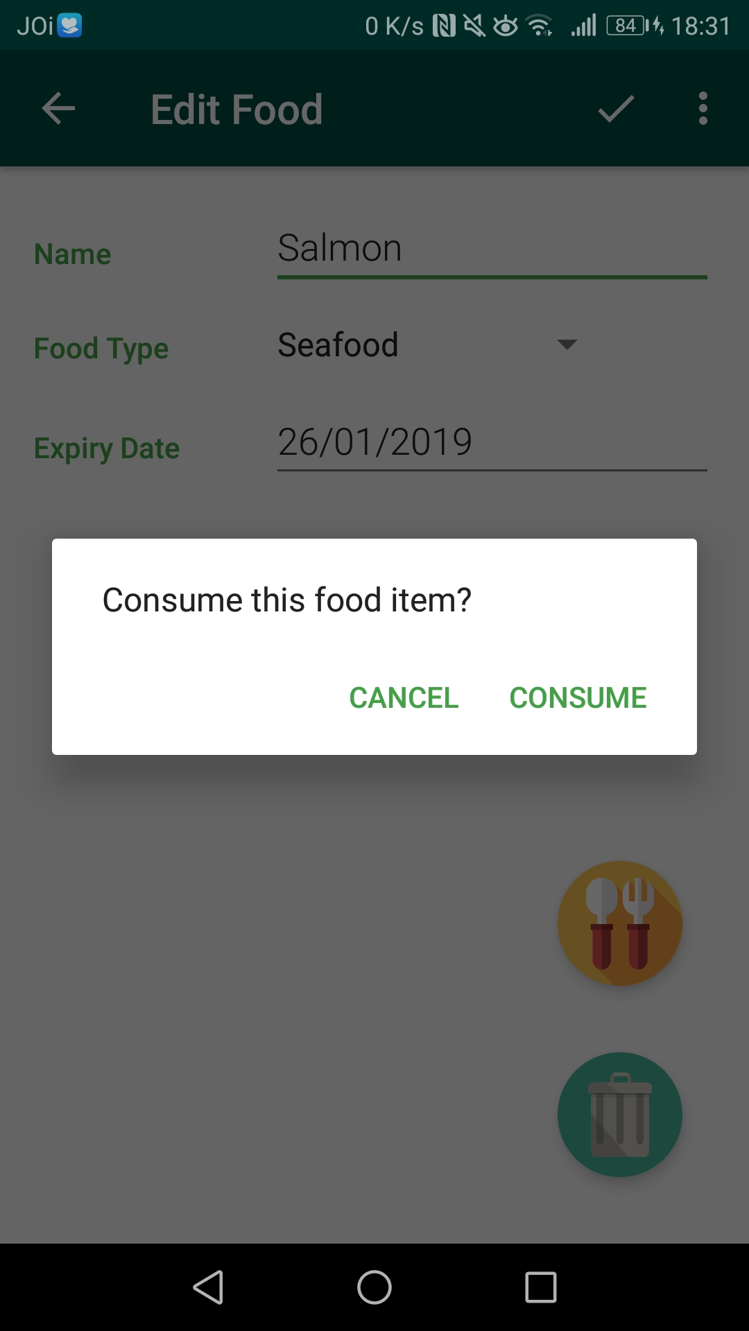
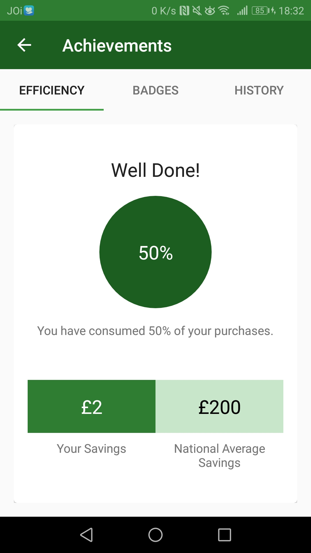
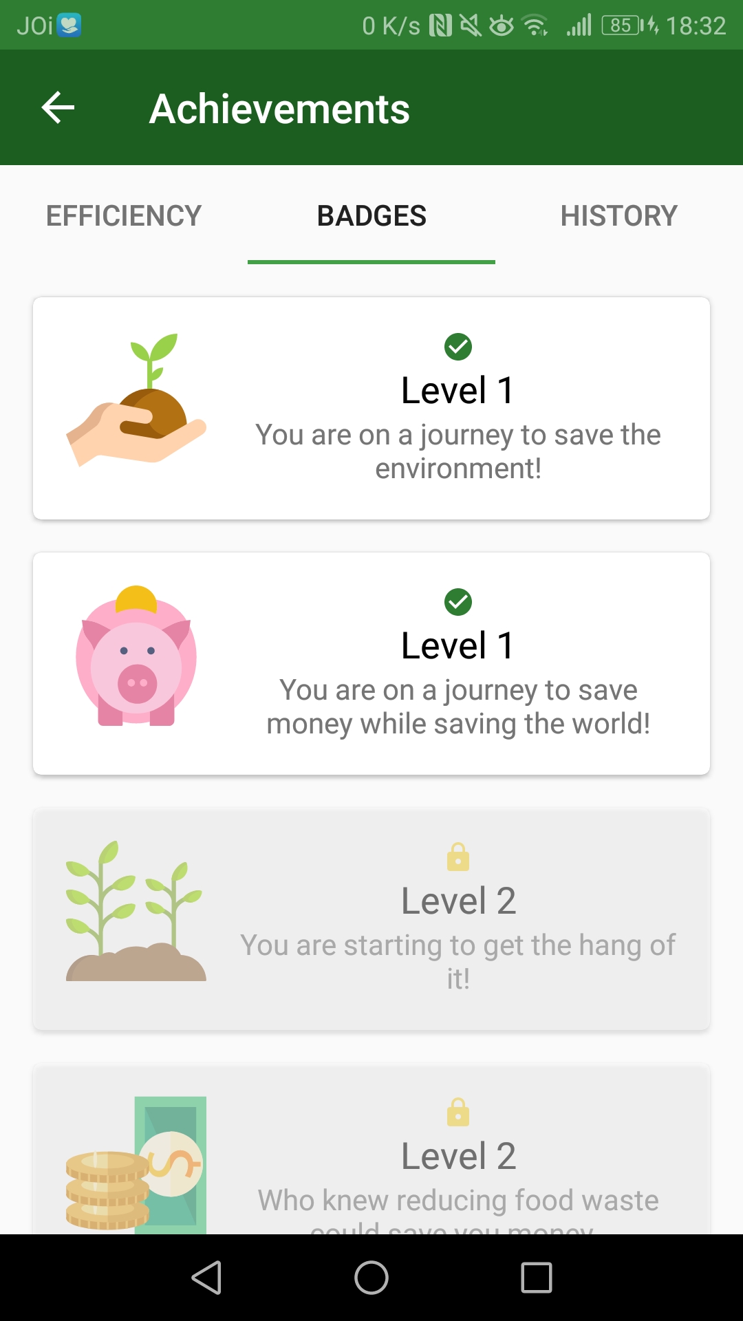
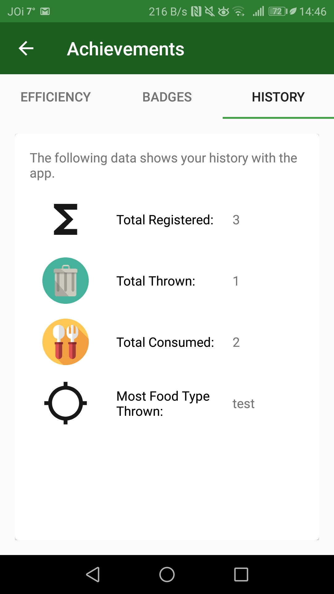
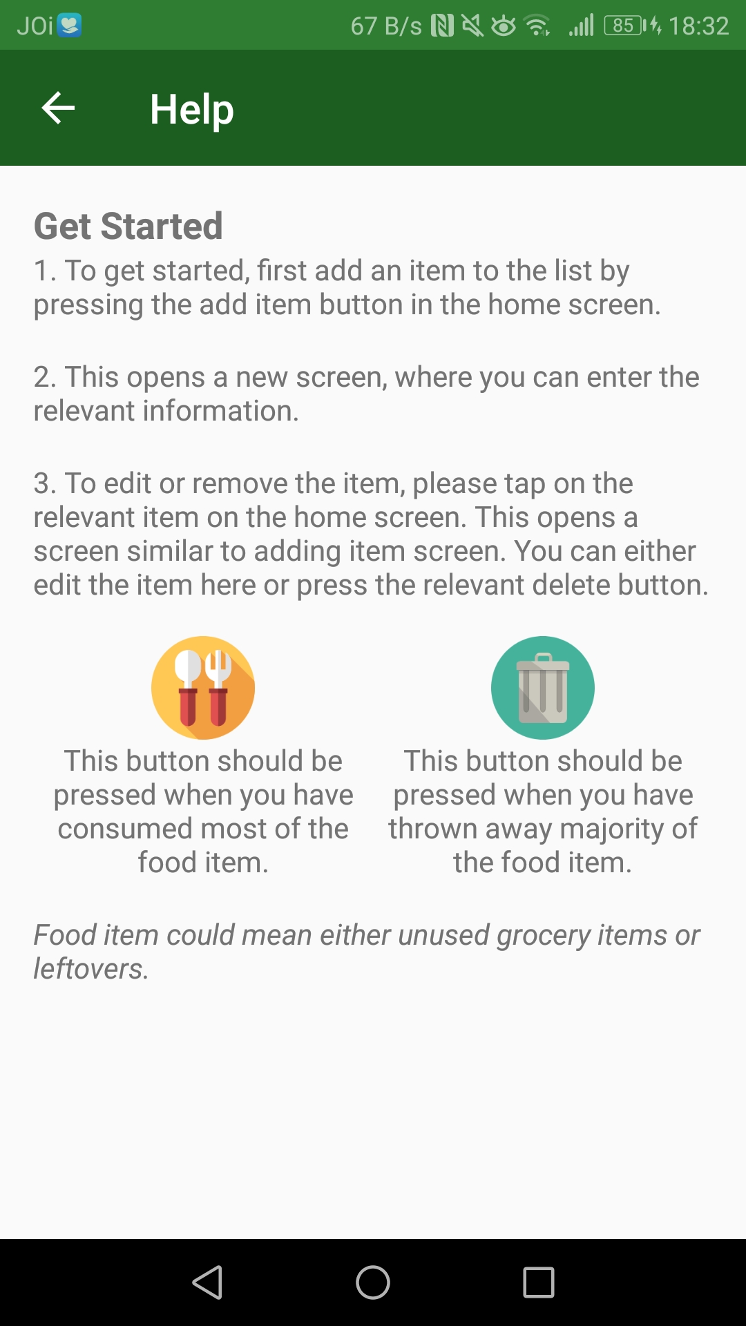
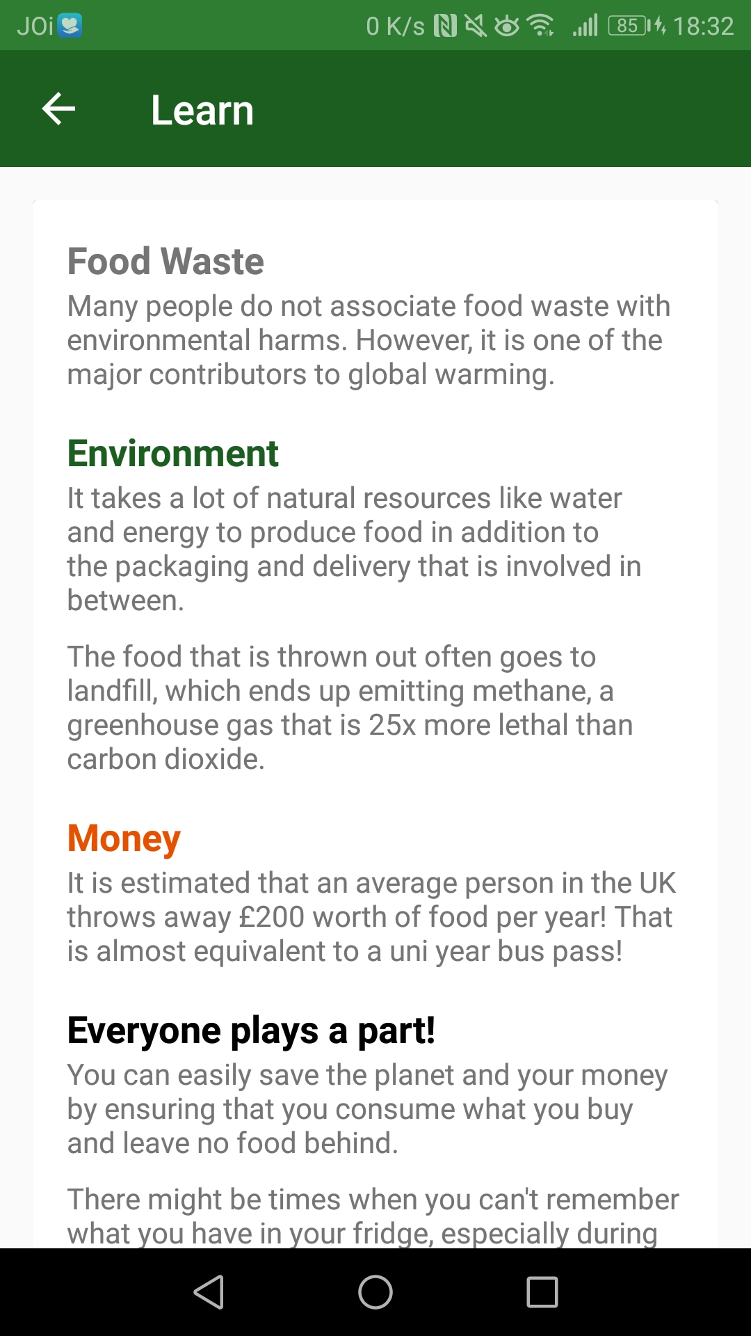
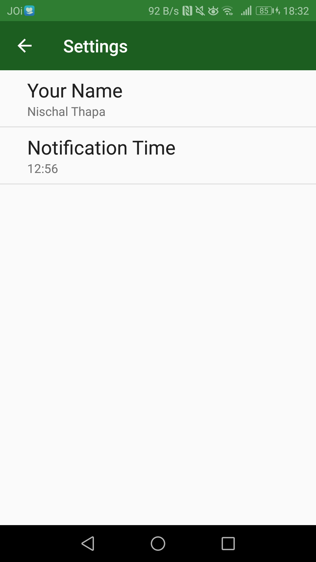
To measure the effectiveness of the persuasive features in the prototype, it was sensible to compare it with another similar product without such features. Therefore, Expiry Wiz was chosen as the control system.
EXPERIMENT DESIGN
A between-subject approach was implemented where 12 participants were pre-screened and split into two groups of 6. There were three phases in the experiment:
Pre-study questionnaire to establish a baseline & task-based usability test to assess efficiency and effectiveness.
Daily use of their respective applications for four days to expose them to the concept and gather opinions.
A post-study questionnaire with System Usability Scale (SUS) to measure usability & interviews for insights.
Icons designed by Freepik, Becris, Eucalyp from Flaticon
USABILITY RESULTS
| Food Alarm | ExpiryWiz | |
|---|---|---|
| Average time taken for task 1 * | 167.17s (faster) | 201.67s |
| Average time taken for task 2 ** | 77s | 60.83s (faster) |
| Completion | 100% | 100% |
| SUS score | 89.2 (better) | 70.4 |
* Task 1 involved adding a list of food items in the app
** Task 2 involved removing specific items off the list
In summary, usability was measured through the SUS scale and the task-based usability test. Although there was no difference in task completion rate and minor differences in time taken to complete the tasks, there was a significant difference in their SUS scores.
INSIGHTS FROM POST-STUDY INTERVIEWS
5 of 6 participants claimed that they would not use Expiry Wiz again while everyone in the Food Alarm said they would use it again in the future with minor improvements.
Participants using Food Alarm were more motivated to perform the tasks because they could receive extra information and satisfaction from the process and effort.
The inclusion of gamification features showed mixed reactions. A few did not realize that the feature was available.
A few were confused in regards to the figures in the home screen, suggesting labels wherever needed.
The user details which were provided for self-monitoring purposes in the home screen did not provide any value to the users.
Both groups expressed the need for a better logging mechanism and provided suggestions such as a barcode scanner or photo recognition system, which would automatically register the food item into the list.
In general, participants from the Food Alarm group showed more enthusiasm towards the system suggesting the prototype to be more fun and useful.
There were many aspects the project could have improved on - time management, project management, resource allocation, etc. As a result, I was unable to do everything that I wanted to do and compromises had to be made.
In particular, I heavily underestimated evaluation. Recruiting real target users can be time-consuming as individual schedules need to be considered on top of suitability. Plus, participants may drop out mid-way which need to be addressed beforehand. Therefore, It requires a lot of time and thorough planning to effectively conduct an evaluation.
Nevertheless, this project was worth all the sleepless nights. Not only did I learn the theoretical aspects of persuasive design and HCI, but I also really enjoyed the practical aspects of the process which turned my curiosity of being a UX designer into an aspiration.